


CSS3 provide us and very good blogger widget which can make our blog very nice attractive and very smooth look to your blogger. Drop-Down Menus and simple menus is look nice but it looks very different and professional.

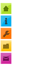
Floating Vertical Mouse Hover Menu
- Login to Blogger > Dashboard
- Go to Design > Edit HTML
- Search for ]]></b:skin>
- Paste Below code above it.
#hor { list-style:none; padding:0; margin:0; } #hor li { float:left; padding:5px; } #hor a { display:block; height: 12px; text-indent:-999em; } #hor a.home { width:46px; background:url(vHome.gif) no-repeat 0 0; } #hor a.download { width:94px; background:url(vDownload.gif) no-repeat 0 0; } #hor a.contact { width:74px; background:url(vContact.gif) no-repeat 0 0; } /* CSS Style for Vertical Menu */ #ver { list-style:none; padding:0; margin:0; } #ver li { padding:2px; } #ver li a { display:block; height:12px; text-indent:-999em; } #ver a.home { width:47px; background:url(hHome.gif) no-repeat 0 0; } #ver a.download { width:95px; background:url(hDownload.gif) no-repeat 0 0; } #ver a.contact { width:74px; background:url(hContact.gif) no-repeat 0 0; } .clear { clear:both; } *{ /* A universal CSS reset */ margin:0; padding:0; } #navigationMenu body{ font-size:14px; color:#666; background:#111 no-repeat; /* CSS3 Radial Gradients */ background-image:-moz-radial-gradient(center -100px 45deg, circle farthest-corner, #444 150px, #111 300px); background-image:-webkit-gradient(radial, 50% 0, 150, 50% 0, 300, from(#444), to(#111)); font-family:Arial, Helvetica, sans-serif; } #navigationMenu li{ list-style:none; height:39px; padding:2px; width:40px; } #navigationMenu span{ /* Container properties */ width:0; left:38px; padding:0; position:absolute; overflow:hidden; /* Text properties */ font-family:'Myriad Pro',Arial, Helvetica, sans-serif; font-size:18px; font-weight:bold; letter-spacing:0.6px; white-space:nowrap; line-height:39px; /* CSS3 Transition: */ -webkit-transition: 0.25s; /* Future proofing (these do not work yet): */ -moz-transition: 0.25s; transition: 0.25s; } #navigationMenu a{ background:url('https://blogger.googleusercontent.com/img/b/R29vZ2xl/AVvXsEgCV77LMh-9aZ6SvdsBBWEpGwPH0khPzhoIhqBwgCgSQjmG02j8UvBomJy1yBh1JphbcCS6XjYf0WsVmfwaGsNZkHi3VaqJ7oOSByACGA68n3-QRFvIGPIpkwrZIUMxk5yLMuawJg5My0Q/s1600/navigation.jpg') no-repeat; height:39px; width:38px; display:block; position:relative; } /* General hover styles */ #navigationMenu a:hover span{ width:auto; padding:0 20px;overflow:visible; } #navigationMenu a:hover{ text-decoration:none; /* CSS outer glow with the box-shadow property */ -moz-box-shadow:0 0 5px #9ddff5; -webkit-box-shadow:0 0 5px #9ddff5; box-shadow:0 0 5px #9ddff5; } /* Green Button */ #navigationMenu .home { background-position:0 0;} #navigationMenu .home:hover { background-position:0 -39px;} #navigationMenu .home span{ background-color:#7da315; color:#3d4f0c; text-shadow:1px 1px 0 #99bf31; } /* Blue Button */ #navigationMenu .about { background-position:-38px 0;} #navigationMenu .about:hover { background-position:-38px -39px;} #navigationMenu .about span{ background-color:#1e8bb4; color:#223a44; text-shadow:1px 1px 0 #44a8d0; } /* Orange Button */ #navigationMenu .services { background-position:-76px 0;} #navigationMenu .services:hover { background-position:-76px -39px;} #navigationMenu .services span{ background-color:#c86c1f; color:#5a3517; text-shadow:1px 1px 0 #d28344; } /* Yellow Button */ #navigationMenu .portfolio { background-position:-114px 0;} #navigationMenu .portfolio:hover{ background-position:-114px -39px;} #navigationMenu .portfolio span{ background-color:#d0a525; color:#604e18; text-shadow:1px 1px 0 #d8b54b; } /* Purple Button */ #navigationMenu .contact { background-position:-152px 0;}#navigationMenu .contact:hover { background-position:-152px -39px;} #navigationMenu .contact span{ background-color:#af1e83; color:#460f35; text-shadow:1px 1px 0 #d244a6; }
- Save your template
HTML Code
- Go to Page Elements
- Choose HTML/JavaScript Widget.
- Paste Below Code in it.
Thanks for Visit Here Like Us on Facebook.
If Any Problem, Ask in Comments Follow US on Twitter.


